

Advanced tips on using images
Images are a great way to enhance the visual look of a page and to draw the reader in. We recommend you use images, but there are a few things to consider when you upload a new image at aalto.fi.
Here are some general guidelines to keep in mind for uploading new images:
- The absolute maximum for a file size is 5 mb, but keep the image as small as possible without negatively affecting the resolution. Normally 1 mb max will be enough.
- The width of the image should be kept to a maximum of 2560 pixels, while 1380 pixels is enough for images that are not used for full screen purposes. You can check the pixel size by right clicking the file on your computer and checking its settings/properties, or through an image editing program such as Photoshop.
- The recommended size for the Hero Magazine image is 951x812 pixels and for the Large hub main image 1648x927 pixels.
- Photographs should be saved in jpg format to enhance colours, while graphics and illustrations should be in png format to save filespace.
- Only photos and images owned by Aalto University are to be used on our website. No free or external image bank photos are used on the site.
Main images have different modes
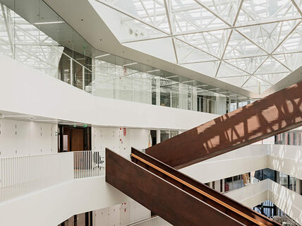
Whenever you create a page, you can choose to have a main image at the top of the page. This image will also show in liftups. There are three display modes for the main image: Default, Medium no-crop and Hide image. Always check what your image looks like in the chosen mode before publishing the page!
- Default will keep the width of the image but crops it into a horizontal ratio, so that it fits in the browser window. Usually this is the preferred mode for main images but be careful that it doesn't look blurry if the file size is too small. Try using an image of 1380 pixels in width, since this will allow for a good resolution also on bigger screens. The maximum size this image is shown is 1380*600.
- Medium no-crop doesn’t crop the image at all, which works better for images of smaller file sizes, but it's not ideal for vertical images. If the image is very long, the user has to scroll down to see it in full, so consider using Default mode for a vertical image.
- Hide image simply hides the image from view, but it will still show in liftups, so put some thought into which image will represent your page and how it looks in a liftup.
Below is an example of default vs no-crop mode for a vertical image. The user has to zoom out to see the full picture in no-crop mode, so in this case, default mode is preferred.


Adapting your image to different formats and using focal point
When uploading a new image, it's stored in the original format and file size, but depending on where it’s used, Drupal will change the format to fit the component. The image will also show in other ratios and resolutions depending on the bandwidth and device that is used by people to access the page. The ratio is changed to fit different screens and the resolution changes so that the page won't take too long to load. Thus, check that the image will look okay in different formats and ratios before using it.
Also, be sure to learn how to change the focal point for your image in Drupal, so that the most important part of the image shows no matter the way it's used at aalto.fi
Using text in images
Text in images is generally not recommended, since it’s not accessible by screen readers, scales badly on small screens and isn’t easily translated between the language versions on the website.
If you still want to use text in your image, make sure to check how it will look in different formats, as described above, and follow these general guidelines:

- Keep the text concise and clear so that it will show when used in different components.
- Use text that is already represented in your written text, so that it’s accessible to people who use screen readers and can’t view images.
- To make the text visible in any format and cropping, move the focal point to the centre of your text. Make sure that there is some space around your text; this will ensure that the text isn’t cropped.
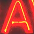
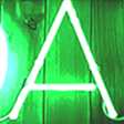
Two examples of images that use text in a good way are shown below.
When text is used on the side of the image, like in the example for Talent Expo 2020, move the focal point to the text to ensure that it's shown in the liftup.
If you use text in several parts of the image, like Re-imagining the Past below, let the focal point stay in the middle of the image and check to be sure it shows well in the liftup.


Using white or transparent background
When creating an image, bear in mind that white and transparent backgrounds will turn light grey when used at aalto.fi, just like the "Change the game"-banners below.