Image aspect ratio at aalto.fi
What is aspect ratio?
The aspect ratio of an image describes the proportional relationship between its width and its height, no matter how big the image actually is. It is commonly expressed with two numbers, separated by a colon, as in 16:9.
| Current aspect ratios used on aalto.fi | ||||
|---|---|---|---|---|
| Original ratio | 1:1 | 1.6:1 | 1.8:1 | 2.3:1 |
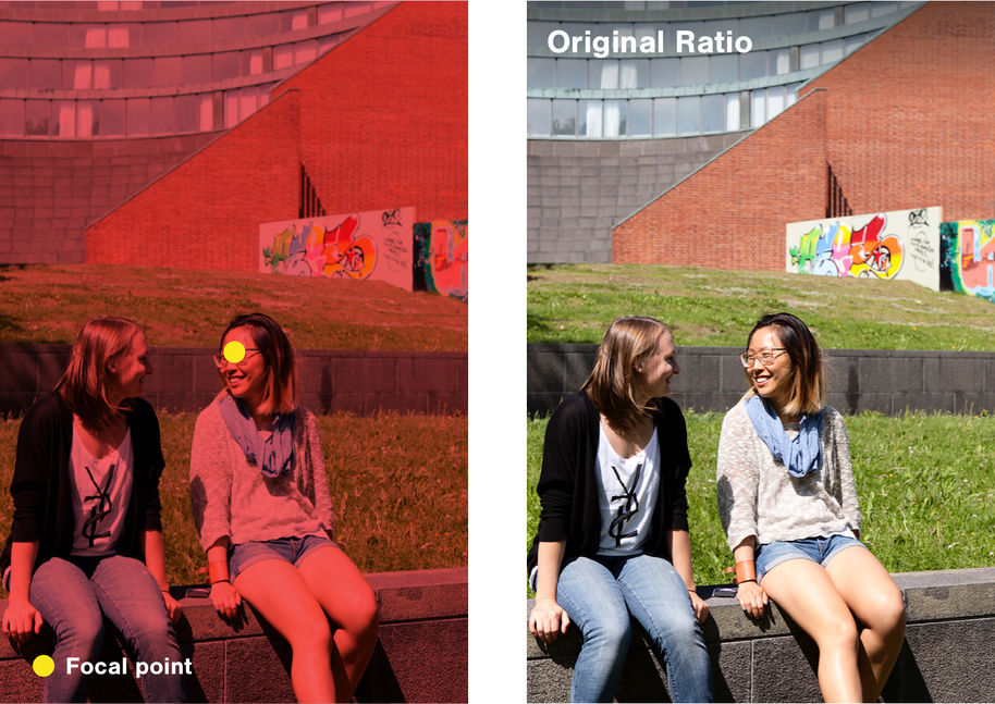
Original ratio
The aalto.fi site allows you to display images that are rendered with their original ratio (without any cropping). This is recommended if you need to display an image in its entirety, such as an infographic or a logo. These are the components that feature images with Original Ratio:
-
Single image: when adding a single image to your page, set the Medium display mode. Read more under Single image
-
Image with text: when adding a single image to your page, set the Default image display mode. Read more under Image with text
-
NB for Content pages, only on Main Image: when defining an image as the Main Image, set the Medium No-Crop setting.
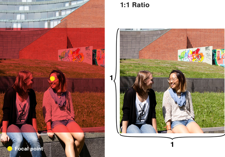
1:1 – Square ratio
The square aspect ratio will crop the image to fit within a square (or a circle).This aspect ratio is used in a variety of spaces across the platform, including:
- Manual Liftups
-
News and Events listings (on desktop view)
For hub editors only:
-
If you use the Hero magazine component, the image will be automatically set to 1:1 ratio.
-
You can set your own hub page main image to fit into a 1:1 circle with the Hub Description component, by setting the Medium display mode. Read more under Hub description
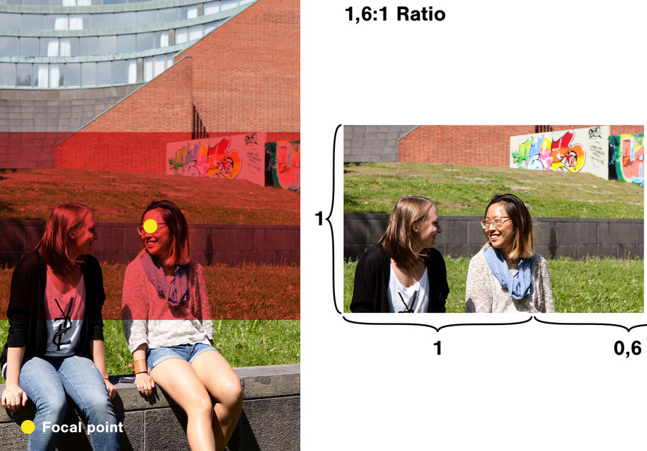
1.6:1 and 1.8:1 – Landscape ratio
These aspect ratios feature a slight landscape format. They are used in a variety of spaces across the platform, including:
-
Single Image Large & Extra large, on mobile devices
-
Events Liftups
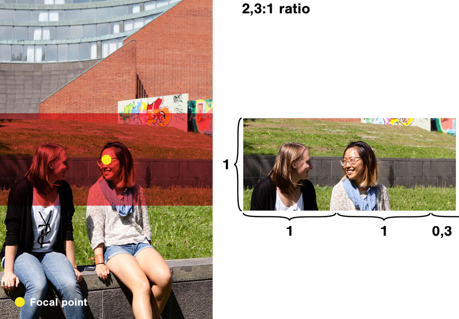
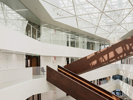
2.3:1 – Very Landscape ratio
This ratio features a very landscape format. It is used to display big and full-bleed images, that allow you to create visually impactful pages. The components that feature images with 2.3:1 Ratio:
-
Single image: when adding a single image to your page, set the Large or Extra Large display mode. Read more under Single image
-
Hub Description: you can set your own Hub page main image to be full bleed by setting the Large display mode for the Hub Description component. Read more under HUB description
FAQs
No. You can display un-cropped images on your own pages by using the correct display mode for the Single Image component or the Main Image component: these images will be rendered with their Original-Ratio. Read more about it in the Original Ration chapter earlier on this page.
We aim to provide a rich and pleasant experience for the user, by offering big and impactful content that delivers brand and excitement, along with compact information that helps navigation. For this reason, we defined a small selection of different Aspect Ratios that allows us to maintain a mobile-first experience, and an engaging big screen navigation.
Liftups and Listing do render the Main Image of each of the page listed, when present. We highly recommend to always set a Main Image for your pages, as it will help the user to recognise and discover your content.