The story behind our letter A
He came up with it at a playground. His two-year-old daughter Frida was tirelessly climbing up the stairs of a slide only to slide right down again, and Rasmus Snabb was thinking he needed an idea that was as simple as possible.
After they got back home, Snabb drew his contest entry, wrote down its reasoning and mailed them for consideration by the jury of Aalto University’s logo design competition. The deadline for submissions was fast approaching, but his entry got there on time.
Rasmus Snabb’s Invitation was named the winner in May 2009.
Quotation mark
‘I was living and working in Denmark at the time, and only heard about the competition one week before the deadline. There was no time to fine-tune a solution, I needed to focus on coming up with a strong idea,’ Snabb says now, 11 years after the competition.
Aalto University Foundation arranged an open design competition for the new university’s logo. In all, 117 submissions were received.
‘I didn’t really think that I might win, I only wanted to communicate to President Tuula Teeri what kind of university I would like to be building.’
Snabb became familiar with the turmoil and resistance surrounding the founding of Aalto when he studied graphic design at the University of Art and Design Helsinki.
‘In my comments, I said that the students in particular don’t want historical or heraldic coats of arms, lions or innovation squiggles, preferring openness and freedom instead. We wanted a new kind of university, somewhere that allows you to influence things yourself. A place that permits curiosity and getting called into question.’
Exclamation mark
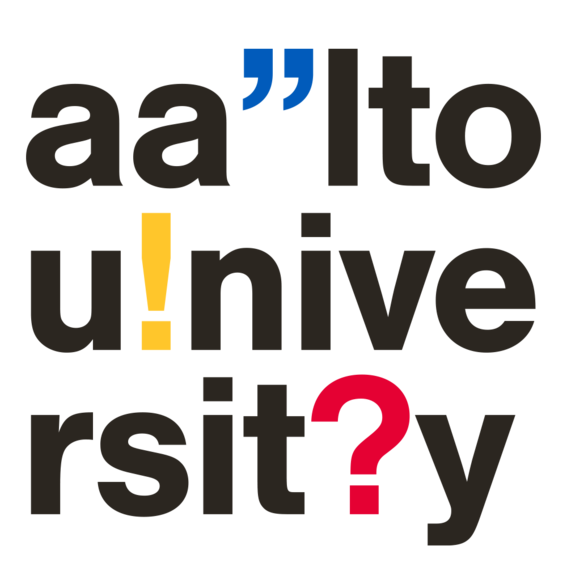
Snabb’s logo spelled out Aalto University, but included an exclamation mark, a question mark and a quotation mark among the letters.
‘This caused a brouhaha both in Finland and internationally: a university plans to adopt such a logo, they must be crazy! To top it all off, some German graphic artist found a similar visualisation online. It had been made for a small-circle typography seminar and wasn’t visibly present anywhere else. I wouldn’t have even known where to pinch it from.’
Because of the alleged plagiarism, a decision was made to edit the proposal – thankfully, says Snabb. He thinks the original submission would have been awkward in practical application.
He drafted a new, simplified version, where the letter A stands beside the name of the University followed by one of three optional punctuation marks. This logo remains in use, though it has been subtly altered over the years by, for example, discontinuing the use of coloured logo versions.
Question mark
During the early years of Aalto, freelance designer Rasmus Snabb was also responsible for the University’s visual appearance more broadly. He thinks that, ideally, the appearance forms its own visual language, a tool users can utilise in a manner characteristic to themselves. It needn’t be a sacred, unchanging thing.
‘The logo could even be so free-form that users are permitted to choose any symbol to stand beside the letter A, a skull, for example. But I doubt the University’s branding will let loose to that extent,’ says Snabb.
He believes Aalto’s distinct and powerful logo is now a source of pride for the University.
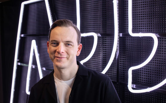
Nowadays, Rasmus Snabb is Head of Design and a partner at communications and influencing consultancy Miltton Group. Snabb was pictured in the lobby of the main building of Aalto, Dipoli, which houses a neon sign version of the University’s logo. Photo: Mikko Raskinen.
This article is published in the Aalto University Magazine issue 26, April 2020.
Read more news

Kira Vesikko advocates for neurodivergent-friendly meetings
In the 100 words series, the Communications Specialist at the School of Electrical Engineering shares how they have promoted equality, diversity and inclusion at Aalto
Aalto participating in study voucher pilot
Study vouchers give young people who have no study place the opportunity to take 30 credits of course at an open university free of charge. With study vouchers, they can explore the various fields of learning at Aalto University by taking open university courses.
UniSport encourages you to stay active – benefits for Aalto community members
In May, Otaniemi celebrates the “Sustainable on the Move” theme month. UniSport offers a variety of benefits and tips for Aalto University students and staff to support everyday physical activity.
