


Aalto Visual Communication Design student shortlisted for the Kantar Information is Beautiful Award

Although major news outlets such as the Guardian and the New York Times are well known for their innovative and celebrated data visualisation, the Aalto community can also look a bit closer to home. Adina Renner, MA student in Visual Communication Design and student research assistant, has been shortlisted for the Kantar Information is Beautiful Award, which will be awarded tonight in New York.
What made you want to create a project based on the Larry Nassar cases?
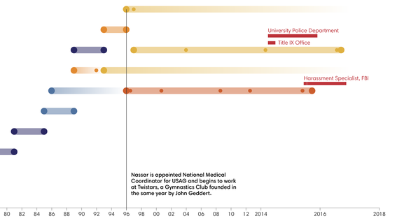
When the abuse scandal around Larry Nassar broke, what shocked me beyond the details of abuse and mistreatment was the number of gymnasts that had been abused and the length of time that the abuse had been going on seemingly unnoticed. Incidentally, we were discussing the topic of "Bias" and "Networks" in one of our courses. The idea of confirmation bias – that one only hears what one expects to hear – made me interested in how humans react when confronted with an ugly truth, such as the abuse of a child. I started looking into the reasons of why people, who had actually been told about the abuse, didn’t come forward and report Nassar. This finally led me to looking not only at the single enabler but at the systemic conditions that allowed the abuse to continue for over 20 years.
What kind of a process has it been to find and put together all information on the subject?
I worked on the project on and off for about three months. The idea and the initial data collection started in the class "Topics in Visualization and Cultural Analytics" with Lily Díaz-Kommonen, Mamdooh Afadila and Khalil Klouche. The first visual output was a classic network diagram showing the various institutions involved in the case as well as the people who have enabled Larry Nassar from within those institutions. In the next class I took, "Information Design II", Juuso Koponen and Jonatan Hildén encouraged us to work on personal projects. I then developed a layout for the website and designed the visualizations (the colours are inspired by the somewhat muted, drab colours in gymnasiums and the shapes are based on the idea of ‘walls’ and breaking through them). I wanted the visualizations to go beyond a standard network graph, so I spent a lot of time iterating over different forms to visualize the data. Finally, in Rupesh Vyas’ class "Advanced Information Design Studio" I finalised the visuals and text, and programmed the visualisations and the website using d3.js, HTML5 and CSS.
As there was no ready-made dataset about the enablers that surrounded Nassar, I built my own based on articles from various news sources. The data collection and maintenance was probably the hardest part of the project. Not only did I have to look into contradicting facts across different news sources, but constant updates to the case made it hard to keep track of changes that effected the data. Some of the women who had filed a lawsuit against Larry Nassar also started out anonymously but later revealed their names in court. This made it hard to relate older statements and facts to newer ones. Beyond these technicalities, I think the fact that this is an extremely heavy and sad topic made the process somewhat slow as well. Reading hundreds of news articles about the case was a very taxing endeavour.


Adina RennerIt’s great that the Information Is Beautiful awards offers an opportunity to address uncomfortable questions and difficult topics.
What has been your aim with your work?
With ‘Wall of Silence’ I wanted to apply Information Design to reveal and help identify certain patterns in a system that enabled abuse. At the time, the news coverage of the case was highly emotional and focused on celebrating the women coming forward. This is, of course, a first important step in reckoning with what had happened. For the sake of not allowing a case like this to happen again however, I think it is just as important to take a step back and look at the conditions that made this case possible in a more systematic way. It is my hope that looking at this case from a distanced but visual point of view will move readers towards thinking about what makes such a system and what role each individual action can play.
It is an honour that my project has been selected for the shortlist alongside the works of so many great information designers and large media outlets, and it’s great that the Information Is Beautiful Awards offers an opportunity to address uncomfortable questions and difficult topics.
See Adina’s project website at Wall of Silence
The Kantar Information is Beautiful Awards celebrate excellence and beauty in data visualizations, infographics, interactives and information art.
Read more news

Nature of Process: Exhibition by the students of the ‘Personal Exploration’ Course
Nature of Process is a multi-material exhibition of 14 Master´s students of Aalto ARTS
Doc+ connects research impact with career direction
Doc+ panels have brought together wide audiences in February to discuss doctoral careers and their diversity.
Apply Now: Unite! Visiting Professorships at TU Graz
TU Graz, Austria, invites experienced postdoctoral researchers to apply for two fully funded visiting professorships. The deadline for expressions of interest is 20 February 2026, and the positions will begin on 1 October 2026.